Newsletter Templates
Newsletter Templates
from €134,70
Weekly, monthly, or whenever-you-feel-like-it newsletter templates. Modular layouts so your marketing team can swap sections without breaking anything.
Weekly, monthly, or whenever-you-feel-like-it newsletter templates. Modular layouts so your marketing team can swap sections without breaking anything.
Newsletters are weird because people sign up for them voluntarily and then ignore them completely. The open rate for most newsletters hovers around 20%. Ours average about 38%. The difference is mostly design and layout, not the content itself.
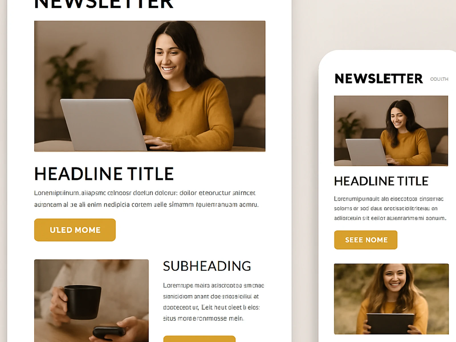
The header should be short and not waste space with a giant logo. The first content block needs to be visible without scrolling on mobile. Each section should be visually distinct so the reader can scan quickly. Links and buttons should be big enough to tap on a phone. And the whole thing needs to look fine in Outlook, which still renders emails like it is 2005.
We build newsletter templates as modular systems. Header block, featured article block, two-column block, image block, quote block, CTA block, footer block. Your team can drag and drop these in whatever order makes sense for each issue. No developer needed for week-to-week changes.
About 35% of email opens now happen in dark mode. Most email templates look terrible in dark mode because nobody tested them. We test every template in both modes and make adjustments so your logo is still visible and your text is still readable when the background flips to dark.
Online · Algeciras